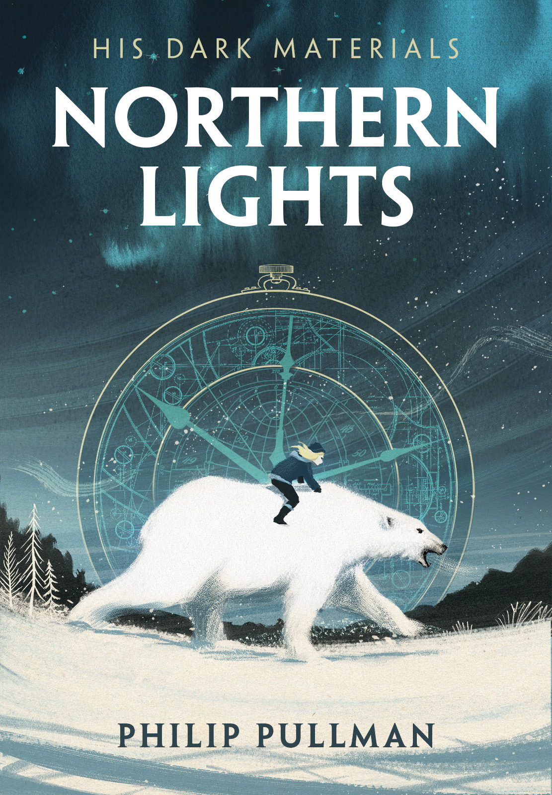
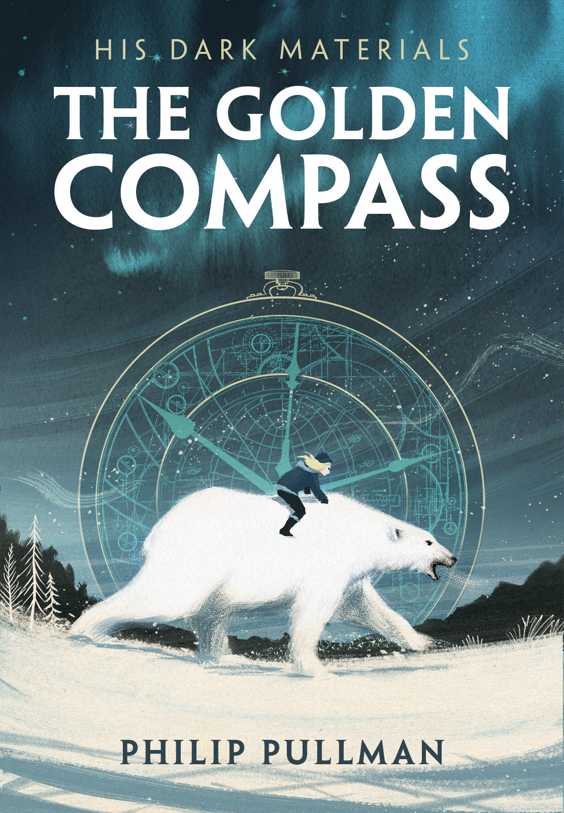
I tried a couple of typography variants for the UK and US release titles, below.
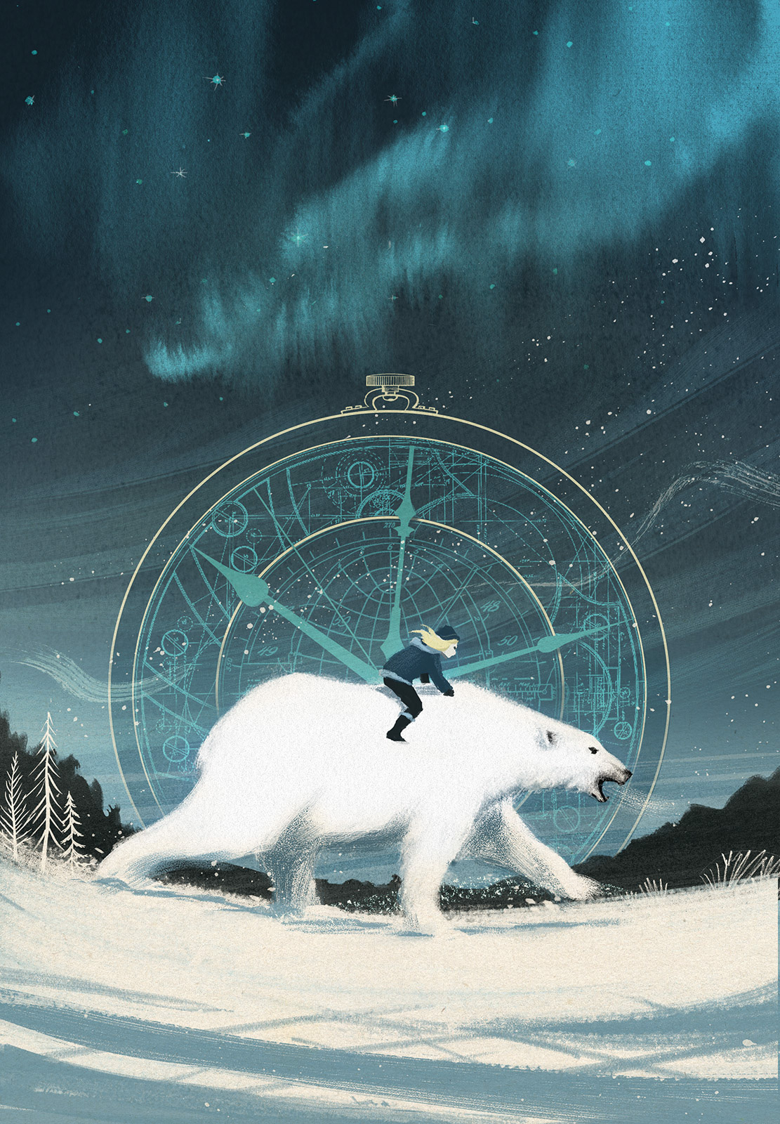
Below: Some elements where drawn in charcoal and ink and then reversed in the final digital comp.
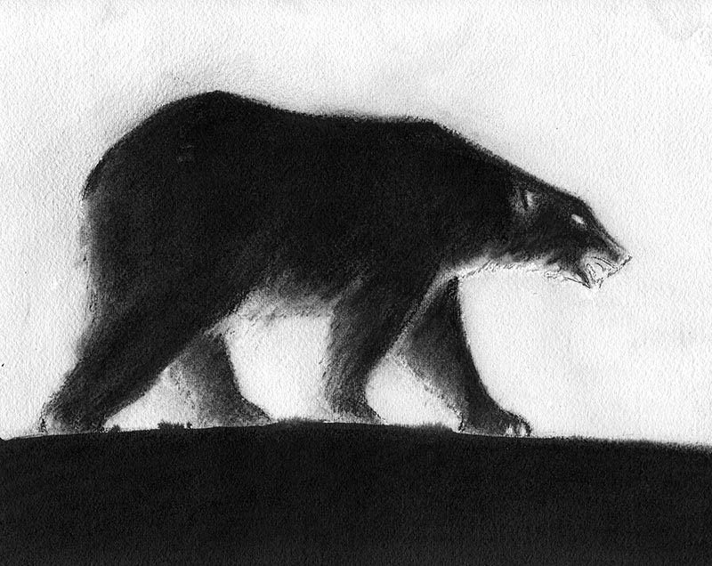
The polar bear was originally drawn in charcoal as a 'negative' image, then reversed in Photoshop. The idea behind this approach was to keep some of the soft charcoal texture in the finished illustration. You can see the final pose of the bear was eventually adapted quite extensively with digital paint techniques.
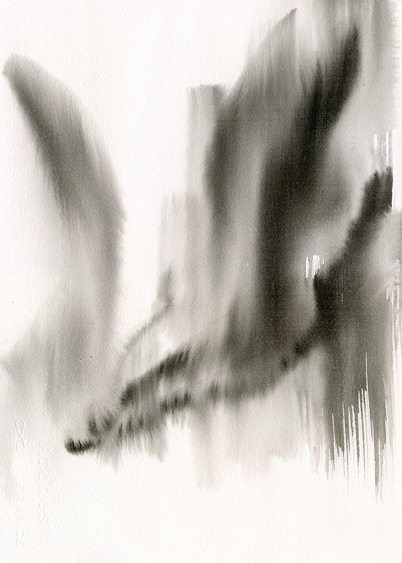
Free-flowing ink washes were used to create the Aurora Borealis texture.